Skip to content

Exposed: What does the fake AI-generated African map reveal about the U.S. and the data they feed Africans?

Top U.S. diplomats presented a wrong AI-generated map of Africa at the AIDS 2026 conference, while African leaders watched. If the world's most powerful government represents Africa with a wrong map, what does that say about the accuracy of every data it has about the continent?

Wrong AI-Generated Map of Africa [Photo by The Independent]

Table of Contents

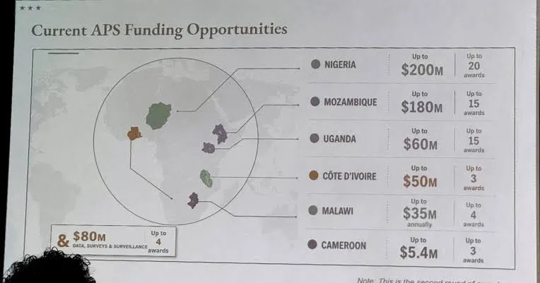
During a formal presentation at the AIDS 2026 conference in Rio de Janeiro, Brazil earlier this week, the United States State Department displayed a map of Africa that was wrong in every labeled detail. The map was supposed to show six countries receiving American health funding and the amount they have received. It showed six countries in the entirely wrong locations, with entirely wrong identities. The room contained senior African government officials, including the director-general of Nigeria's national health agency.

The images spread within minutes. Attendees photographed and filmed the slide and posted the footage online, where it gathered thousands of views and a wave of public reaction that ranged from disbelief to fury. After close scrutiny by viewers and observers alike, it was revealed that the visual material contained an almost invincible artificial intelligence watermark, linking it to OpenAI's tools. The State Department subsequently confirmed the map was AI-generated, produced by a team member who altered the presentation at the last minute before the event.

How it happened: The presentation was delivered by Jeff Graham, the senior U.S. health envoy who leads PEPFAR, the President's Emergency Plan for AIDS Relief, which channels billions of dollars annually into HIV treatment across Africa. Graham led a team of top U.S. diplomats to the AIDS 2026 conference to announce new bilateral health agreements with African governments. The map appeared halfway through his presentation, intended to illustrate which six countries were party to those agreements, their location on the continent (to show that the impact is balanced) and the amount they have received so far.

The six countries named were Nigeria, Mozambique, Uganda, Ivory Coast, Malawi, and Cameroon. Not one of them was correctly identified by lines pointing from the names to the positions on the map. Nigeria was shown as landlocked, deep in the Sahara Desert, despite sitting on West Africa's Atlantic coast. Mozambique was relocated from southeastern Africa to the Horn of Africa. Ivory Coast appeared on the opposite side of the continent from its actual location.

Kenneth Ngure, the president-elect of the International AIDS Society, described the mislabeled map as "disheartening" and said "African countries must be taken seriously." Atlantic Council analyst Matt Petit said those responsible "did not know where countries in Africa are and did not care to check their work." AIDS expert Emily Bass, writing about the incident at length, said the failure to catch the error before displaying it "in a session that featured the Director General of Nigeria as an invited guest, is not only disrespectful to African collaborators, it's also a significant tell."

The State Department attributed the error to a team member who "hastily altered the slide deck immediately before the presentation," and said it took "full responsibility for the confusion and misrepresentation it caused for attendees, including our African partners." According to reports from multiple sources, Jeff Graham did not respond to requests for comment. OpenAI has released a statement saying it was investigating the matter, with experts saying the prompt fed to the AI tool is what really matters.

Former State Department and NSC Africa official Cameron Hudson connected the blunder to the Trump administration's decision to cut roughly a third of the State Department's workforce, eliminate layers of experienced bureaucracy, and replace career experts with more junior staff operating with less supervision.

Why it matters: The map error is embarrassing, but what it points to is even worse. The United States has for decades been the primary source of health data, poverty statistics, disease burden estimates, and demographic figures about Africa, figures that determine where global funding goes, which interventions get prioritized, which populations are counted, and which are not. In fact, the data about Africa released by the U.S. determines how African governments plan and how Africans see themselves. If the institution responsible for delivering those programs to six specific African countries cannot correctly locate those countries on a continent map, the question of how carefully it has verified the underlying data that drives those programs is a legitimate one. This is the thing many African analysts and researchers have raised for years: that much of what the world believes it knows about African civilization, colonialism, poverty, mortality, and disease is constructed from datasets assembled by institutions that treat the continent as a subject rather than a partner, and this incident made that concern visible to every concerned citizen across the globe. The apology the State Department issued changes nothing about the structural problem that made the error possible.

Source: Reuters via NBC News / Al Jazeera / Africanews / CNN / Washington Post

Top News is The African Exponent's daily briefing on the continent's leading headline. The reports are written by our editors. Click through to the original sources for full reporting.

Comments

Latest

Why is Ghana the gateway to Africa for investors?

Why is Ghana the gateway to Africa for investors?

Ghana has become one of the continent’s most important investment gateways. Home to the African Continental Free Trade Area Secretariat, the country gives businesses a strategic base to reach a market of 1.4 billion people with a combined GDP of about $3.4 trillion.

Members Public